
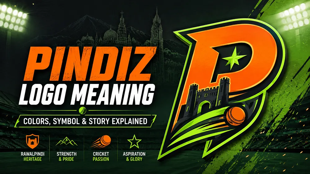
Pindiz Logo Meaning: Colors, Symbol & Story Explained
The Pindiz logo represents speed, energy, passion, and the strong identity of Rawalpindi. Its bold “P” symbol, orange center, and neon green outline give the team a fresh and modern look.
Unlike many PSL teams, Pindiz does not use an animal, warrior, or shield as its main symbol. The logo instead uses a simple letter-based design built around movement and energy.
Pindiz Logo Meaning at a Glance
| Logo Element | What It Represents |
| Letter “P” | Pindiz and Rawalpindi identity |
| Orange Center | Passion, energy, and competitive spirit |
| Neon Green Outline | Fresh and modern look |
| Sharp Shape | Speed and intensity |
| Bold Wordmark | Confidence and strength |
The full design is made to look fast and active. This style fits the quick and exciting nature of T20 cricket.
What Does the Pindiz Logo Mean?
The Pindiz logo represents speed, confidence, and competitive energy. Its main symbol is a sharp letter “P” that gives the team a strong and modern identity.
The design also connects the franchise with Rawalpindi. Instead of using a traditional mascot, Pindiz focuses on its name, colors, and bold visual style.
What Does the “P” in the Pindiz Logo Represent?
The large “P” represents the team name Pindiz. It is also linked with “Pindi,” the common short name used for Rawalpindi.
The letter is designed with sharp lines instead of a normal font. This gives the symbol a sense of speed, movement, and power.
That makes the logo suitable for a fast-paced T20 cricket team.
What Does the Orange Color Mean?
Orange is the main color in the Pindiz logo. It represents passion, excitement, energy, and a strong competitive spirit.
The bright color also helps the team stand out. Very few PSL teams use orange as such an important part of their identity.
This makes the Pindiz branding easier to notice on jerseys, social media, and other team graphics.
Why Does the Pindiz Logo Use Neon Green?
Neon green is used around the main orange symbol. It gives the logo a fresh, bright, and modern appearance.
The green outline also makes the orange center more visible. Together, the two colors create a strong contrast.
This color combination gives Pindiz a younger and more modern sports identity.
What Does the Pindiz Wordmark Represent?
The word “Pindiz” is written in bold and sharp letters. The style matches the shape of the main P symbol.
This helps the complete logo feel fast and confident. It also gives the brand a similar look across jerseys, social media, and merchandise.
The wordmark is simple, but it remains easy to recognize.
What Does the Name Pindiz Mean?
The name Pindiz comes from “Pindi,” the popular short name for Rawalpindi. The name gives the franchise a direct connection with the city.
The added “z” gives the name a more modern brand style. It also makes the team name different from the normal use of “Pindi.”
This local connection is an important part of the team’s identity.
Why Did Pindiz Become Rawalpindiz?
Pindiz was first introduced as the main branding name for the Rawalpindi franchise. Later, Rawalpindiz was also adopted for the team.
Both names are connected with the same PSL franchise. This is why cricket fans may search for both “Pindiz logo” and “Rawalpindiz logo.”
The Pindiz name still remains an important part of the team’s visual branding.
Who Owns the Rawalpindi PSL Team?
The Rawalpindi PSL franchise is owned by Walee Technologies. The company acquired the franchise rights in February 2026.
The reported acquisition price was PKR 2.45 billion, or Rs. 245 crore.
The ownership became an important part of the franchise’s launch before its first PSL season.
For full team details, visit our Rawalpindiz PSL Team guide.
How Was the Pindiz Logo Revealed?
The Pindiz logo was revealed before PSL 2026 at the Shahbaz Sharif Sports Complex in Rawalpindi.
The launch used a graffiti-style artwork rather than only a normal press event. Pakistan fast bowler Naseem Shah also took part in the reveal.
A bike rally was also held as part of the celebrations in Rawalpindi.
The unusual launch matched the team’s goal of building a different and modern identity.
Why Did the Pindiz Logo Get So Much Attention?
The logo received attention because it looks different from most traditional PSL team logos.
Its bright orange and neon green colors quickly stood out online. Some fans liked the fresh design, while others had mixed views about it.
The discussion helped the new team gain attention before its first PSL season.
For a new franchise, being easy to recognize can be very important.
How Does the Logo Represent Rawalpindi?
The logo represents Rawalpindi mainly through the Pindiz name and its strong visual identity.
Using “Pindi” inside the team name creates a direct link with the city. The bold design also gives the franchise its own personality.
This helps Rawalpindi have a clear identity within the Pakistan Super League.
You can explore PSL Teams to see how other franchises represent their cities.
Why Is the Pindiz Logo Different From Other PSL Logos?
Many PSL teams use animals, warriors, helmets, or traditional symbols in their logos.
Pindiz takes a different approach. Its identity is mainly built around a letter, bright colors, and sharp shapes.
This gives the team a cleaner and more modern look.
It also makes the Pindiz name itself the main part of the brand.
Pindiz Logo vs Other PSL Team Logos
The biggest difference is simplicity. Pindiz does not depend on a detailed mascot or large traditional emblem.
The bold P symbol can be easily used on shirts, caps, social media posts, and merchandise.
This simple style can also make the brand easier to recognize on small mobile screens.
That is useful for a modern sports franchise with a strong digital audience.
Is Pindiz the Same as Rawalpindiz?
Yes. Pindiz and Rawalpindiz refer to the same Rawalpindi-based PSL franchise.
Pindiz was used strongly in the team’s original branding. Rawalpindiz was later used as the wider franchise name.
That is why both names may appear in news reports, social posts, and fan searches.
Why Does the Pindiz Logo Matter?
A strong logo helps a new sports team build recognition. This is especially important when a franchise is entering a league for the first time.
The Pindiz logo gives Rawalpindi a clear visual identity in the PSL.
Its bright colors and simple P symbol make the design easy to notice and remember.
As the team plays more seasons, the logo may become more closely connected with its players, fans, and history.
Final Thoughts
The Pindiz logo meaning is mainly connected with speed, energy, passion, and Rawalpindi identity.
The bold P represents Pindiz, while orange adds energy and neon green gives the design a modern look.
Its simple style makes it different from many other PSL logos.
Whether fans like the design or not, Pindiz has created an identity that is easy to notice and difficult to confuse with another PSL team.
FAQs
What is the meaning of the Pindiz logo?
The Pindiz logo represents speed, energy, passion, and Rawalpindi identity. Its main design uses a bold P symbol with orange and neon green colors.
What does the P stand for in the Pindiz logo?
The letter P represents Pindiz. The team name is linked with “Pindi,” the common short name for Rawalpindi.
Who is the owner of the Rawalpindi PSL team?
Walee Technologies owns the Rawalpindi PSL franchise. The company acquired the franchise rights before PSL 2026.
Why did Pindiz become Rawalpindiz?
Pindiz was the original branding name, while Rawalpindiz was later adopted for the wider franchise identity. Both names refer to the same PSL team.
Where was the Pindiz logo revealed?
The logo was revealed at the Shahbaz Sharif Sports Complex in Rawalpindi before PSL 2026.
Is Pindiz the same as Rawalpindiz?
Yes. Pindiz and Rawalpindiz are names used for the same Rawalpindi-based Pakistan Super League franchise.




2 Comments